Merge Social Security and Public Sector Pensions
When solutions to the challenge to provide retirement security to American citizens in the 21st century are considered, they typically address either social security or public sector pensions, but rarely focus on both of these systems together. But when considered together, as systems that each have unique strengths and weaknesses that might be combined in a single program available to all Americans, options present themselves that might otherwise be ignored.
With both social security and public sector pensions, the challenge of maintaining financial sustainability is dramatically affected by the demographic reality of an aging population. As increasing numbers of people live well into their eighties and nineties, the ratio of workers to retirees edges closer and closer to 1.0.
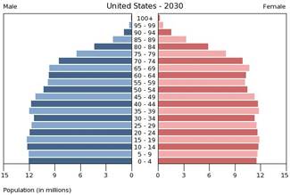
There are four ways to address the reality of an aging population: (1) Increase withholding from current workers, (2) Increase the retirement age, (3) Lower the level of retirement benefits, and (4) Increase the amount the retirement trust fund can earn. Before delving into each of these further, however, it is important to identify one crucial advantage the USA enjoys vs. virtually all other major developed nations. America, alone among major nations, is projected to have a perfectly even distribution of ages within its population.
AMERICA’S DEMOGRAPHIC ADVANTAGE
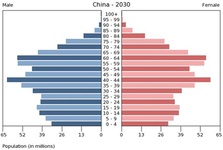
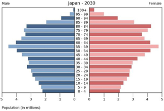
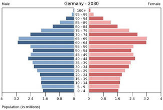
America, like all developed nations, has an aging population. But as the four charts below indicate, unlike all other major developed nations, America’s population is replacing itself at an even rate. It is difficult to overstate the serendipity of this phenomena, nor the advantage that it imparts to policymakers intent on engineering sustainable retirement security for American citizens. Not only does having an even age distribution, with an equal number of people in every age group, guarantee that America’s worker-to-retiree ratio will be more favorable – higher – than that of other major nations – but, as will be seen, this higher proportion of productive workers yields other significant economic benefits.
Here are the projected age distributions in 2030 for the 2nd, 3rd, and 4th largest economies on earth, China, Japan, and Germany (the Eurozone economies, in general, have an age distribution similar to Germany’s):
For each of these nations, what can be seen are a large proportion of individuals who are either in their late working years or retired. In each case, the number of people under the age of 10 are only about half as numerous as the number of people aged 55-65. These nations are on track to have a worker to retiree ratio – all else being equal – that is literally half as favorable as the USA, as can be seen on the next table:
America’s success in replacing its population to create an even distribution of ages makes meeting the challenge of retirement security far more feasible than it will be in the rest of the developed world. This advantage, however, does not mean that America’s retirement programs do not face wrenching challenges. America may be on track to have a sustainable population, which is good, but America is still an aging nation. Starting in 1946 with the so-called Baby Boom, American’s produced about 4.5 million babies each year. This was an unprecedented number of children being born in the U.S., which meant that even as the WWII generation retired and enjoyed life average expectancies that set new records, their children grew up and populated the workforce in numbers that greatly exceeded the number of retirees. Now that the baby boomers themselves are retiring, the ratio of workers to retirees in America is lowering. Because, unlike the Europeans or East Asians, Americans are replacing themselves, this will be a one-time lowering. But it represents a huge adjustment.
THE COST OF PUBLIC SECTOR PENSIONS VS. SOCIAL SECURITY
Complicating the challenges of funding retirement security for an aging population is the generosity of the pension programs that have been granted government workers in America. It is difficult, if not impossible, to get exact amounts paid in aggregate to retired government workers, but here is a useful equation that allows one to estimate and compare the amount paid to government workers, in total, to the amount paid to social security recipients, in total. The case can be made that we are already on track to spend more each year on public sector pensions to retired government workers, who represent 20% of the workforce, than we spend on social security to the entire population of retired private sector workers, representing 80% of the workforce:
(public sector pensions) 1.5S x 67% x 30% > S x 33% x 70% (social security)
In the above equation, “S” denotes the average salary of a private sector worker. Because the average government worker earns 50% more, on average, than the average private sector worker, their salary is denoted as “1.5 S.” The next variable is a percentage showing what, on average, the typical public sector pension is as a percent of final salary, 67%, vs. what, on average, the typical private sector social security benefit is as a percent of final salary, 33%. Finally, the last percentage in each equation shows the percentage of the retired population receiving a public sector pension, 30%, vs. the percentage of the retired population receiving social security, 70%. An observant reader will immediately question why a 70/30 ratio of retired public sector workers to private sector workers is used, since public sector workers only comprise 20% of the workforce. This is because the average public sector worker retires ten years earlier than the average private sector worker, hence they may only represent 20% of the working population, but they are 30% of the retired population.
If you calculate these variables, you will see that expenditures per year to support public sector workers in the U.S. are on track to exceed the total social security payments by a ratio of 1.3 to 1.0. This ratio doesn’t currently apply, because many public sector workers retired at a time when the benefit formulas were far less generous than they are for current workers (ref. Government Worker Understates Average Pension).
For a much more expansive analysis of the disparity between social security payments and public sector pension benefits, including links to source data, using California as an example, ref. The Cost of Government Pensions. Here are some charts from that analysis that underscore the point made in the preceding paragraphs:
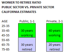
In the above table, it can be seen the result of an average retirement age of ten years earlier for public sector workers translates into a 1-to-1 ratio of workers to retirees, since the U.S. enjoys an even distribution of ages within the population. This is based on assuming an average age to commence working of 25 and an average life expectancy of 85. In all, a 60 year span between beginning work and death is probably reasonable. Under this scenario, the private sector workforce is on track, at an average retirement age of 65, to have a 2-to-1 ratio of workers to retirees.
In this table, using data for California (ref. source links in The Cost of Government Pensions), it can be seen that the average public sector worker makes 1.5 times as much in base salary than the average private sector worker. Based on data from CalPERS and CalSTRS, the average pension for public sector retirees in California who have worked 30+ years and have recently retired is well in excess of $45K per year, but 66% is a good conservative benchmark to use for comparison, particularly since it is difficult to access a national average for all state and local government workers. The $15K per year national average for social security is well-documented, and equates to about 33% of the average annual private sector wage.
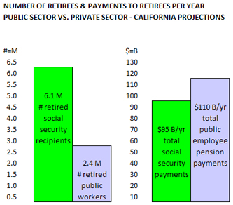
This table puts together the preceding data for California’s retired population and projects a $110B per year outlay in pension payments to support 2.4 million retired public sector workers (local, state and federal), compared to a projected $95B per year outlay for 6.1 million retired private sector workers. What both the equation “1.5S x 67% x 30% > S x 33% x 70%” as well as the three tables above are intended to convey is a startling fact: The United States taxpayers going to be spending MORE on payments to public sector retirees, comprising 20% of the workforce, than they will spend per year on social security payments to the entire population of private sector retirees, comprising 80% of the workforce.
DUBIOUS PREMISES OF PUBLIC SECTOR PENSION FUND INVESTING
Before delving into scenarios whereby the social security fund and the public sector pension funds in the United States can be combined into one single system where the same formula is applied to all citizens, it is important to explore something unique to public sector pension funds; the fact that these funds are invested, and that returns on these investments yield additional capital that can be used to help meet pension payment obligations to retired government workers.
There are a host of fallacies and dubious premises that accompany the practice of relying on investment returns to shield taxpayers from fully funding government worker pensions. While all of these are debatable, they would include the assumption that government workers, funded by taxpayers, shall reap the financial rewards of investment returns, yet social security recipients shall not. Or the assumption that these government employee managed, labor union influenced, massive pension funds – pouring hundreds of billions through Wall Street brokerages every year – do not exercise a distorting influence on market returns, inordinately influence corporate governance, carry a political agenda, invest offshore, or aren’t themselves engaging in a mutually corrupt partnership with aggressively managed hedge funds that extract over-market returns using manipulative tactics in a zero sum market – i.e., causing lower-than-market returns for small investors who rely on their 401K investments for their retirement. But the most dubious premise of all is the myth that these pension funds can project long-term annual rates of return (after inflation) of nearly 5.0%.
There are two reasons that rates of return of 7.75% per year cannot be achieved (4.75% after adjusting downwards for inflation – this is CalPERS and CalSTRS official long-term projected rate of return, and is fairly typical of the rates used by most other public sector pension funds). They are the trends of demographics and debt. In the case of the public sector pension funds, the demographic challenge is compounded by the fact that new retirees, on average, receive far more generous benefits than existing retirees.
THE DEMOGRAPHIC CHALLENGE
The demographic challenge to 7.75% rates of return is a matter of simple supply and demand. When the worker-to-retiree ratio for public sector workers reaches 1-to-1, and when long-time public sector retirees are enjoying pensions that are derived using the same formula as workers just entering retirement – both of these things will happen if current policies aren’t changed – then for the first time, the massive government employee pension funds, currently managing about $4.0 trillion in assets in the United States, will be selling as many equities as they are buying. With funds this large, this will completely change the dynamics of the market.
The larger private sector workforce also is trending towards a smaller worker-to-retiree ratio, moving from today’s approximate 3-to-1 ratio to a 2-to-1 ratio by 2030. Presumably these private sector retirees will collectively own additional trillions in equities. In 2030, for every two private sector workers purchasing equities to eventually use when retired, there will be one retiree who is selling equities. This move from a 3-to-1 buyer-to-seller ratio to a 2-to-1 buyer-to-seller ratio will also have a dramatic macroeconomic impact on stock prices. There will be less demand for stocks and other passive investments because there will be more sellers than ever.
THE DEBT CHALLENGE
The debt challenge to 7.75% rates of return is, if anything, more daunting than the demographic challenge. The accumulation of debt in the U.S. enabled faster economic growth than would have otherwise occurred. Inflated asset values, especially private homes, enabled trillions in borrowing at unusually low rates. These trillions were immediately plowed back into the economy on consumer products or more homes, fueling both corporate profits and home prices – which raised the value of corporate equities and enabled further borrowing. The table below, documented with links to source data in the post “National Debt and Rates of Return,” shows the aggregate total market debt for the United States economy as a percent of GDP for the last 120 years:
The data for the above table is gathered from three sources, which all corroborate a sobering fact – the total debt in the U.S. is currently higher than it was during the great depression in the 1930s. Currently the reported total debt / GDP ratio in the United States is 370% and rising. At the height of the great depression, total debt / GDP was barely 300%. The above table breaks the last 120 years of American history into four 30 year financial eras. In all four 30 year periods, the total U.S. debt fluctuated between 140% and 160% of GDP. Two of the 30 year periods, the those beginning in 1890 and 1950, respectively, saw debt as a percent of GDP display very little variation. For example, between 1890 and 1920 the maximum debt/GDP ratio was 165%, and the minimum debt/GDP ratio was 125%. For the period beginning in 1950 the variation was even more unremarkable, with the 1950 beginning level of 140% comprising the lowest ratio, and the 1980 ending level of 160% comprising the highest ratio. This parallel between the two relatively stable periods makes any parallel one may infer between the two relatively unstable periods quite ominous. Because the 300% debt/GDP extreme achieved in 1930 took 20 grueling years to unwind.
During this same 20 year period, between 1930 and 1950, the Dow Jones Index moved from 286.10 downwards to 206.05. To the extent this stagnancy was caused by slower economic growth due to mandatory deleveraging, there is no reason to expect any growth whatsoever from publicly traded equities in the U.S., since debt today is a higher percentage of GDP than it was in 1930. The reality of an aging population, which increases the seller-to-buyer ratio in the equities markets creates an additional downward pressure on returns that was not present in the 1930’s.
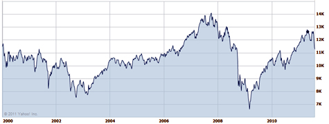
These trends occur against the backdrop of a stock market that never recovered from the crash of 2000. As referenced in the post CalPERS Projected Returns vs. Reality, here is a chart of the Dow Jones Industrial Averages staring in January 2000, and running through mid-August 2011 (they haven’t changed significantly since then):
What is immediately clear from viewing this chart is that where the index began, nearly 12 years ago, and where it is now, are pretty much the same. To be precise, the Dow entered the week of January 4, 2000 at 11,522, and the Dow entered the week of August 8, 2011 at 11,269 (ref. Yahoo Finance – DJIA 1-2000 to 8-2011). The Dow has actually declined over the past 10.5 years.
Moreover, this loss of equity value should be measured using inflation adjusted dollars, not nominal dollars. If you review the Consumer Price Index from the U.S. Dept. of Labor, you will see that in January 2000 the index stood at 168.8, and in June 2011 the index stood at 225.7. This means that it would take $1.33 today to purchase what $1.00 would have purchased in 2000. From this perspective, the Dow index today would have to stand at 15,406 just to have kept up with inflation. Put another way, in real dollars, the Dow has lost 2.67% per year for the last 11.5 years.
One might argue that the Dow is not representative of the U.S. equities market, because the arcane formula that governs its calculation only incorporates a handful of blue-chip companies. Below is the S&P 500, an index that tracks 500 of the largest publicly traded companies, most of them based in the U.S. and traded on the New York Stock Exchange:
On this chart it is obvious that even in nominal dollars, the S&P 500 is lower today than it was nearly 12 years ago. As it is, the S&P 500 entered the week of January 4, 2000 at 1,441, and the Dow entered the week of August 8, 2011 at 1,179 (ref. Yahoo Finance – S&P 500 1-2000 to 8-2011). When you take into account inflation, the S&P 500 today would have to be at 1,927 just to break even with where it was 11.5 years ago. Put another way, in real dollars, the S&P 500 has lost 4.19% per year for the last 11.5 years.
PENSION FUND CONTRIBUTIONS ARE VERY SENSITIVE TO RATES OF RETURN
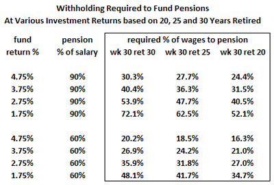
When analyzing the variability of required pension fund contributions based on 30, 25, and 20 year retirements, while assuming 30 years of work, the results on required contributions are dramatic. These calculations, including tables showing their complete methodology, using as examples the typical pension plans offered California’s safety and non-safety public sector workers, are explored in depth in the post “What Percent of Payroll Will Keep Pensions Solvent.” Here is the summary:
In the above table, the first set of four rows show various scenarios based on a pension equivalent to 90% of final salary, the second set of four rows show various scenarios based on a pension equivalent to 60% of final salary. One might suggest the first set of rows depicts public safety workers, representing approximately 15% of California’s 1.85 million state and local government workers, and the second set of rows depicts everyone else working for state and local government agencies in California.
For each pension example, the fund return is calculated at a best case of 4.75% per year, which is the official rate used by CalPERS currently, and is the rate used by most public employee pension funds across the U.S. That return is then dropped by 1.0% in each of the next three rows. It is important to note that these are “real” returns, after inflation, which is typically projected at 3.0% per year. In nominal terms, CalPERS official long-term projected rate of return is 7.75% per year. So in nominal (before adjusting for inflation) terms, the four returns evaluated on this table are 7.75%, 6.75%, 5.75%, and 4.75%. To keep this in perspective, the “risk-free,” nominal rate of return on the 10 year Treasury Bill is 3.0% per year, nearly two percent lower than our worst case scenario in this analysis.
As can be seen by reviewing the first column in the boxed set of data on the table, when someone works 30 years and is retired 30 years, and has a pension equivalent to 90% of their final salary, if you drop just one-percent from CalPERS official long-term projection, you have to increase the annual pension fund contribution by 10.1% of salary – from 30.3% per year to 40.4% per year. And if you want to be even more realistic when estimating necessary public sector pension fund contributions going forward, take into account pension spiking, staggering losses to the funds over the past 10 years, and retroactive pension benefit increases.
To expound further on what may be a realistic rate of return for multi-trillion dollar retirement funds in an economy with an aging population is beyond the scope of this analysis. For the proposed options to follow, the operating premise is that such funds, at best, will not yield returns that exceed the real rate of broader economic growth. Especially due to the aging population which creates more retirees who are sellers in the market. And mid-single digit economic growth will remain elusive as long as total market debt exceeds 370% of GDP.
TAXPAYER-FUNDED RETIREMENT SECURITY REQUIRES ONE-FORMULA FOR ALL
If one strips away the reliance on investment returns and compares social security to public sector pensions based on payroll withholding from current worker’s providing 100% of the funds required to make current payments to retirees, it quickly becomes obvious that public sector pensions are completely unsustainable, whereas social security can be rendered permanently solvent with relatively minor tinkering. Here’s why:
Public sector pensions pay retirees, on average, 2/3rds of what they made when they worked, and based on an average retirement age of 55, there will be one worker in the public sector for every retired public sector worker. This equates to 66% withholding on current government workers to fund retired government workers. Social security, by contrast, pays retirees, on average, 1/3rd of what they made when they worked, and based on an average retirement age of 65, there will be two private sector workers for every retired worker collecting social security. This equates to 16% withholding on current private sector workers to fund workers who have retired on social security.
Social Security and public sector pensions have something in common; they are both defined benefits. Retaining the defined benefit at some level to provide a minimal safety net to all citizens is something for which most Americans would agree. Determining what level of defined benefit is both adequate and financially sustainable is harder. But the exercise is simplified if you eliminate the inherently corrupt practice of investing taxpayer’s retirement funds in speculative investments. It is also simplified by the fact of America’s even age distribution, which makes the actuarial calculations far less complex. Using these assumptions, a average defined benefit equal to 1/3rd of salary can be provided to all American’s, if they are willing to contribute 16% of their salary to a retirement fund.
There are two elements to social security’s defined benefit formula that are absent from the defined benefit enjoyed by public sector workers. The first is the progressive nature of social security. A low wage earner may actually collect a social security benefit equaling as much as 50% of their income, whereas a high wage earner’s social security benefit will probably be closer to 10% of their income, or less. The second is that the social security plan adds up the entire career earnings of each beneficiary in order to calculate their entitlement, whereas public sector pensions are typically calculated by multiplying the number of years a beneficiary worked by a factor (usually between 2% and 3%), and multiplying that result by their final year’s earnings. Both of these elements belong in a merged plan; one to create more equity for low income earners and to place a cap on the maximum benefit, the other to take into account the total earnings history of each beneficiary to more equitably calculate how much they may receive.
By incorporating progressive benefits, imposing a cap on benefits, and raising the annual ceiling at which earnings become exempt from withholding, it may be possible to sustainably pay out an average pension to low and middle income wage earners that exceeds 33% of their average career earnings. Raising the retirement age to improve the worker-to-retiree ratio can also accomplish this. When exploring retirement security options based on this pure pay-as-you-go system, one can quickly visualize both a reasonable, sustainable retirement safety net for all citizens, as well as grasp just how problematic it becomes to raise taxpayer funded retirement benefits much beyond 33% of average annual career earnings.
AMERICA’S ECONOMIC ADVANTAGES
While the U.S. confronts an aging population and crippling levels of total market debt, the U.S. is nonetheless clearly positioned as having the strongest and most resilient economy in the world. America’s age distribution, while in transition to an older average age, has the unique virtue of being perfectly evenly distributed. New workers are replacing retiring workers at a 1-to-1 ratio, and the overall ratio of workers to retirees will never dip below 2-to-1. No other major economy has this advantage; most of them face a desperate shortage of new workers. This will ensure not only sufficient payees into any retirement security scheme, but it will ensure adequate numbers of workers to produce goods, and adequate numbers of workers to consume them. It is difficult to imagine how America’s sustainable demographic profile will not grant a significant economic advantage over the other major economies of the world over the next 20-30 years.
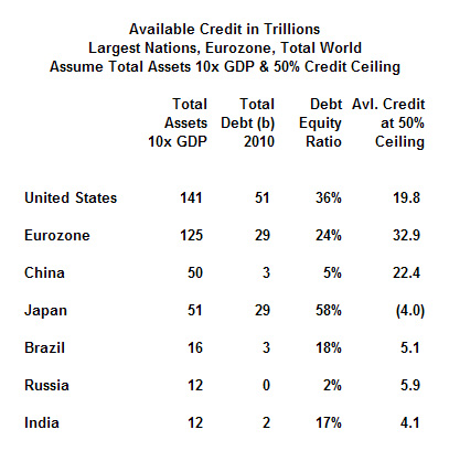
Surprisingly, America’s debt profile, while dire, is comparable to most other major nations. The chart below shows the estimated amount of available credit, by major economy, based on known levels of total debt in each economy, compared to their estimated collateral expressed as a multiple of GDP. For the purposes of comparison, available credit is calculated by assuming a nation’s collective borrowing remains viable up to an amount equivalent to 50% of their collective assets. As can be seen, the absolute value of each nation’s GDP has a decisive effect on the calculation, since countries with much larger GDPs such as the U.S. have as much remaining borrowing capacity – 19.8 trillion – as the much smaller Chinese economy – 22.4 trillion – despite the fact that China has a debt/equity ratio of 5% vs. America’s 36%.
At first glance this chart suggests that the U.S., with a debt/equity ratio of 36%, is in considerably worse shape than the Eurozone and China. But this chart was compiled nearly a year ago (ref. National Debt and Rates of Return) and is based on a huge assumption: Debt in the Eurozone and China were simply assumed to be triple their reported government debt.
Starting with Europe, the problem with this assumption is that the European banks have issued Euro bonds that aren’t calculated on any national balance sheet. Retirement obligations and current worker entitlements in Europe have stressed their borrowing capacity and threaten the very existence of their currency. China’s economy, while logging formidable growth over the past 20 years, is overly reliant on exports and construction. While the Chinese don’t appear to have a serious debt problem based on the simplistic assumption that their total debt is merely 3x reported government debt, their banking system is opaque, their real estate assets are grossly overvalued, and their exports cannot possibly continue to grow at the rate they have. Just a slowdown in the rate of export growth could have a sharply negative impact on China’s asset values – and when collateral collapses, debt as a percent of equity rises accordingly. And China’s fitful progress on human rights, along with Europe’s attempts at integration which may have peaked, guarantee these economies will struggle with social distractions unheard of in the U.S.
Finally, because of their impending demographic implosion for which neither of them are prepared, Europe and China face a very uncertain economic future. Japan, by contrast, has already experienced twin implosions – demographic and collateral – and with the worst behind them, Japan may surprise the world in the coming years. But Japan, with a $5.0 trillion economy and an imploding population, will never seriously rival the U.S. as the premier global economy.
ECONOMIC GROWTH IMPROVES RETIREMENT SECURITY OPTIONS
For the United States to flourish economically, she will have to reduce debt as a percentage of GDP while somehow managing to log rates of economic growth in the mid-single digits. More than anything else, this will require engaging in deficit government spending that yields long-term economic returns, rather than simply to pay out entitlements and inflated wages and benefits to government workers.
The economic problems in the rest of the world guarantee the U.S. dollar will remain a hard currency. They mean that the Chinese yuan will not deliver a sustained appreciation against the dollar, even if they finally float their currency on open markets. They mean that the Euro, even if it survives, will also be regarded as less stable than the dollar. The size and diversity of the American economy, the demographic sustainability of the American population, the stability of American society, and the historic status of the U.S. dollar as the reserve currency of the world are all contributing factors to the likely appreciation of the dollar for the next few decades.
The infrastructure projects of the 1930’s should provide inspiration to policymakers and economic planners today. The impact of these roads, dams, and power infrastructure were clear – they lowered the cost of living at the same time as they raised the standard of living. Unlike today’s seductive but economically disastrous “green” initiatives, infrastructure investments of the 1930’s made transportation, water and power cost less. This policy decision of the 1930’s – investing government funds to lower the cost of living – gave people more discretionary income to purchase new inventions – radios, cars, home appliances. And these new inventions created new asset classes which created new collateral, improving the overall national debt/equity ratio.
This is where government investment should go, into 21st century versions of the big projects of the 1930’s whose legacy still provides benefits to the American people. We need practical public works projects that will lower the cost of transportation, water and energy. We need upgraded freeways with “smart lanes” where ultra-efficient cars and buses will eventually drive themselves. We need to upgrade existing rail lines and limit the building of “bullet trains” to where they might be cost-effective; maybe Washington to Boston but probably nowhere else. We need to develop nuclear power, clean coal, shale oil and gas, and lower the cost of energy. We need to build cost-effective desalination plants and new water storage and distribution infrastructure – and to make these massive projects affordable and for the greater good, we need to roll back or eliminate unnecessary environmental regulations, environmentalist lawsuits, and project labor agreements.
Along with infrastructure investments, the federal government should invest in high-technology, which is essential to maintaining economic preeminence. A mission to Mars, a lunar base, and multiple orbiting outposts would consume hundreds of billions in funds, but result in almost unimaginable commercial growth and technological spinoffs. The federal government should also increase investments in basic science and medical research. As infrastructure investments lower the costs for energy, water, and transportation, and technology investments create new options for entrepreneurs, entirely new industries can spontaneously emerge in the private sector, from space commercialization to life extension, to things we can’t imagine today.
To fund these investments without increasing the deficit requires revisiting entitlement reform and eliminating special, cripplingly expensive pensions for government workers. While some classes of government workers may qualify for a premium when calculating their retirement compensation, such as those who operate in the military or high-risk public safety jobs, there is no reason why the vast majority of government workers should get anything other than a new and upgraded, economically sustainable social security benefit.
In order to minimize disruption to the markets, public sector pension funds can be liquidated systematically over a ten year period. They can be moved slowly but steadily into investments of minimal risk, such as ten year treasury notes, and placed under the administration of the Social Security Trust Fund. Moving these funds into T-Bills will also help finance the deficit until GDP growth raises tax revenues. And to preserve America’s demographic advantage as well as nurture its technological prowess, immigration laws need to be restructured to emphasize admission of highly educated and highly skilled workers.
These are prescriptions for economic growth, which will improve the options for whatever retirement benefit formulas are adopted.
If the U.S. were to merge all taxpayer supported retirement entitlements into social security, it would fund the revitalization of the U.S. economy. Redirecting government spending into productive investments instead of entitlements would create an economic boom that would create opportunities for all Americans. By moving the government out of the business of making speculative investments through Wall Street brokerages, that special interest as would see a significant erosion of its power and influence. Perhaps most important of all for a global perspective, the 21st century might then follow the 20th as another American century, a most desirable outcome for those who believe in the American experiment, in democracy, in pluralism, in competition and capitalism, innovation, progress, and the optimism and big ideas that have always defined America in the eyes of the world.
This article originally appeared on the website CIV FI on November 29, 2011 and is republished here with permission.

